


I’m easily overwhelmed by too much information.
My mom and I have this running joke about how we’re both excruciatingly incapable of following along with the 10-30 second instructions at the start of any Big Brother challenge.
When forced to intake an influx of info on the spot, my brain… well, it pretty much self-destructs.

And as a product designer that gives me a lot of empathy when creating onboarding experiences that don’t make potential users panic and leave.
And that’s what I want to talk about in this post: how to present information without overwhelming users.
When it comes to guiding users within an app, one useful strategy for helping them feel competent is progressive disclosure.
It’s a technique you can use to simplify complexity by gradually revealing more detailed information over time. And it’s especially useful anywhere people have to absorb complexity while also deciding whether they want more of it.
Why use progressive disclosure
Complexity has a measurable cost that simple progressive disclosure methods can prevent.
The Baymard Institute, a UX research company, looked at progressive disclosure in e-commerce checkout flows.
One that caught my eye was their observation of how users engaged with the following checkout flow from a company called Cabela, an e-commerce platform for hunters.
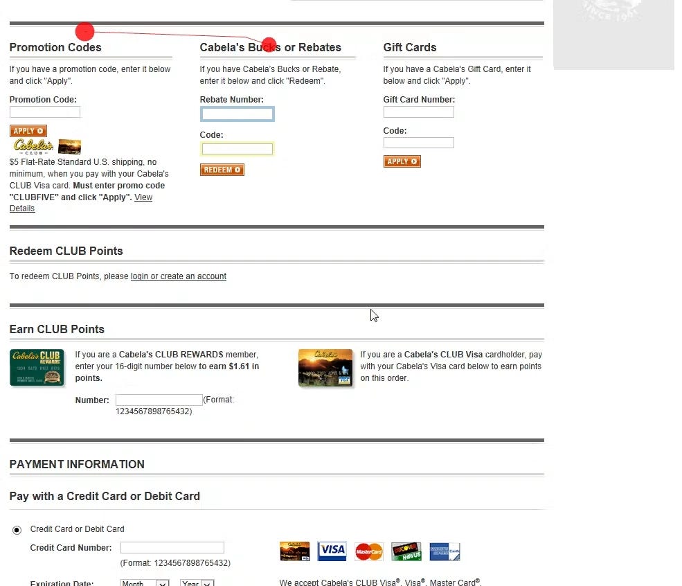
They noticed that 66% of users stopped progressing when they encountered that large block of input fields for promo codes and gift cards.
They noted that some users couldn’t even find the payment fields below. And other Baymard studies found that showing promo fields like that can also trigger users to stop and question whether they were getting the best deal.
This all goes to show that when we reveal too many features at the same time, users who don’t benefit from those more advanced features are the ones who suffer most.
Usually, posts about progressive disclosure provide a list of common components you can use to hide advanced information or features from new users. Things like accordions, tabs, and modals. But I want to look at it from a higher level and offer some more unique conceptual approaches you can apply more broadly to prevent Cabela’s conundrum from happening in your products.
10 ideas for how you can use Progressive Disclosure in your app
1. Copy what’s comfortable
Use recognizable concepts so users understand at first-glance what to expect and where to expect it.
When users encounter an app that resembles one they’re already familiar with, they’ll arrive primed with an idea of how to use it and there’s a higher chance they’ll like it more than if you introduced a bunch of novelty.
Imagine, for example, that you wanted to make a new streaming platform where people can post bite-sized cooking videos. Let’s call it RECIpea.
You love YouTube, so you decide to take inspiration from their design system.
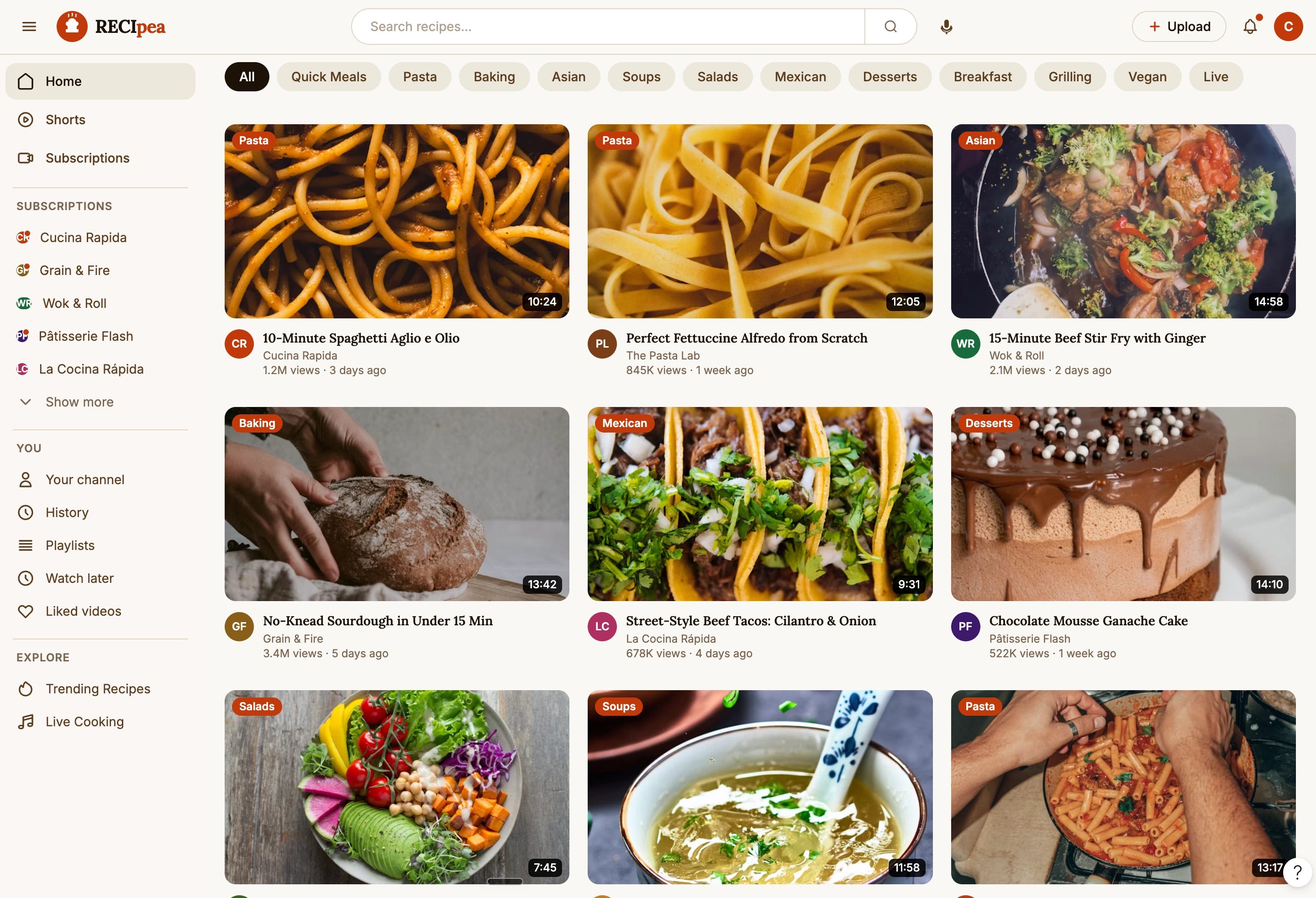
If you were to conduct a usability test on the that UI and ask a user to show you how they would subscribe to a channel, you might be pleased to see them click on the name underneath the video in hopes of landing on the channel page.
Because that’s where the Subscribe button lives on YouTube.
If instead you decided to take design inspiration from Netflix, and ask a user to do the same task of subscribing to a channel, you might be disappointed to discover them fumbling around, because the concept of channels is foreign to Netflix.

To make things easier for your users, sometimes the hardest yet most helpful thing to do, is rein in your creativity and pull from common patterns your users are already accustomed to.
2. Design for curiosity
One of my favourite quotes is by the artist Jean-Michel Basquiat. If you look at his work you’ll often notice words or phrases with a strike through them.

He’s quoted as saying:
“I cross out words so you’ll see them more. The fact that they’re obscured makes you want to read them.”
That line is the basis for using progressive disclosure, not just to hide information users don’t yet need, but to persuade them to want it.
Ordinary progressive disclosure says, “don’t show complexity until it is needed”. But sometimes complexity is needed to inform users about our product’s potential.
In those cases, we can take inspiration from Basquiat by obscuring sections, in order to draw attention toward them, rather than just omitting them altogether.
Consider, for example, any site that blocks or blurs locked content to entice people to uncover what’s hiding behind the veil.
The language-learning app DuoLingo is a good example of this.
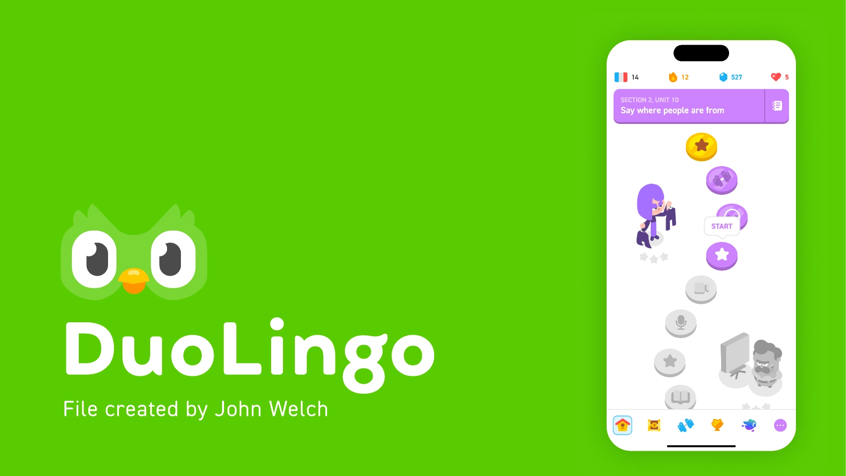
Notice how they use progressive disclosure to grayscale and block more advanced lessons until a user has unlocked them by completing easier exercises first.
3. Feed them just a slice
If you’ve ever created flashcards for yourself, then you’ve already used a prompt type of progressive disclosure.
And it can work just as well in a user interface.
By providing some relevant context and asking users to predict the missing piece they want, you give them a sense of where they are in a roadmap, what comes next, and that they’re just one step away from getting the answers that they now know they lack.
You’ll often notice apps use this strategy in their onboarding.
They’ll ask you what specific features or outcomes you’re looking for and then provide templates or solutions related to your goal.
For instance, instead of overwhelming you with every item in their catalog right away, the Netflix onboarding asks you to select what you like, so it can feed you a curated selection first.
Strategic use of progressive disclosure doesn’t showcase the extreme breadth of opportunities your app makes available. Instead, it aligns itself to what your users are looking for and offers them a filtered set of opportunities customized just for them.
4. Zoom-out; zoom-in.
The most quintessential version of progressive disclosure reveals the next most relevant step once a stage is complete.
Google Maps gives us a good side-by-side comparison within its own app.
When we select a destination and ask for directions, we have 2 main options for how we can view that information:
We can look at the overview of steps, put the app away, and try to recreate each step from memory.
Or we can take the progressive disclosure route by following the directions one step at a time.
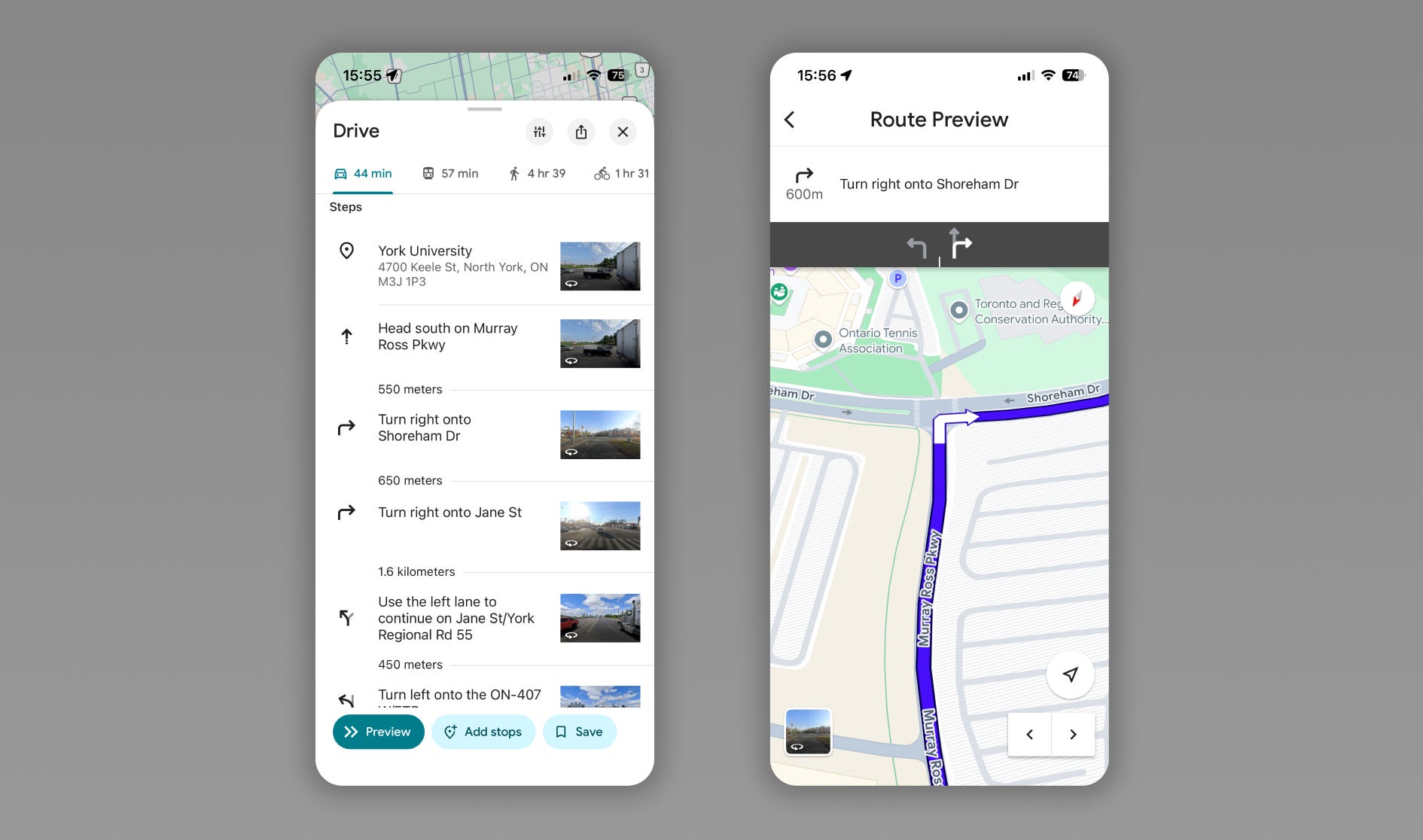
Sometimes the answer isn’t to hide all advanced information from users. We can also show them where we plan on taking them and how we plan on getting them there. Providing both a map and step-by-step navigation can balance both worlds.
5. Profile their behaviour
Deduce your users’ intentions based on their actions.
I remember the first time I used Figma. I experimented a bit and created my first few frames. Then I hit command S to save my work. Figma responded with a little message at the bottom of my screen saying something like “don’t worry about saving your work, we auto save it for you”.
Smart applications of progressive disclosure reveal advanced features when users need them, but not before.
Figma could have given me a product tour with that message during my onboarding, but I didn’t need to know that information then. I didn’t have any work to save when I just opened the app. So instead they waited for the moment when I needed that information most.
The key to using progressive disclosure yourself is to understand your user’s intentions in their current stage. If they’re in step 1, it’s probably not the time to teach them about step 5.
6. Let them peek behind the curtains
Offer users a taste of what’s to come and hint at what’s needed to get there.
You would have experienced this version of progressive disclosure any time you visited an app’s landing page.
Often, what you’ll find are screenshots of the app either halfway through or having accomplished the transformation that the app promises.
7. Choreograph some rhythm
Present valuable information at predictable and expected intervals.
This version of progressive disclosure is one that newsletter writers and course creators love.
They’ll break down large topics and email them out in multiple units, giving their audiences digestible information over time, while ensuring they internalize a recurring progression.
Creating a predictable rhythm gives people a sense of control.
It’s pretty daunting to be instructed to read an entire textbook in a month. But it sounds a lot more doable to be asked to read a small chapter a day.
8. Reduce time to impact
Promise a destination and a meaningful path toward it.
If a person wanted to use progressive disclosure unethically, they would promise a huge outcome and provide such small meaningless breadcrumbs along the way.
The benefit to them is that their users keep coming back more frequently. But more often than not, this strategy risks alienating users once they catch on to the fact that they are not actually making enough progress in the time they hoped.
One of the best examples that comes to mind is dating apps. So many of them promise to help users find true love, yet so few facilitate the interactions that can actually fulfil that promise.
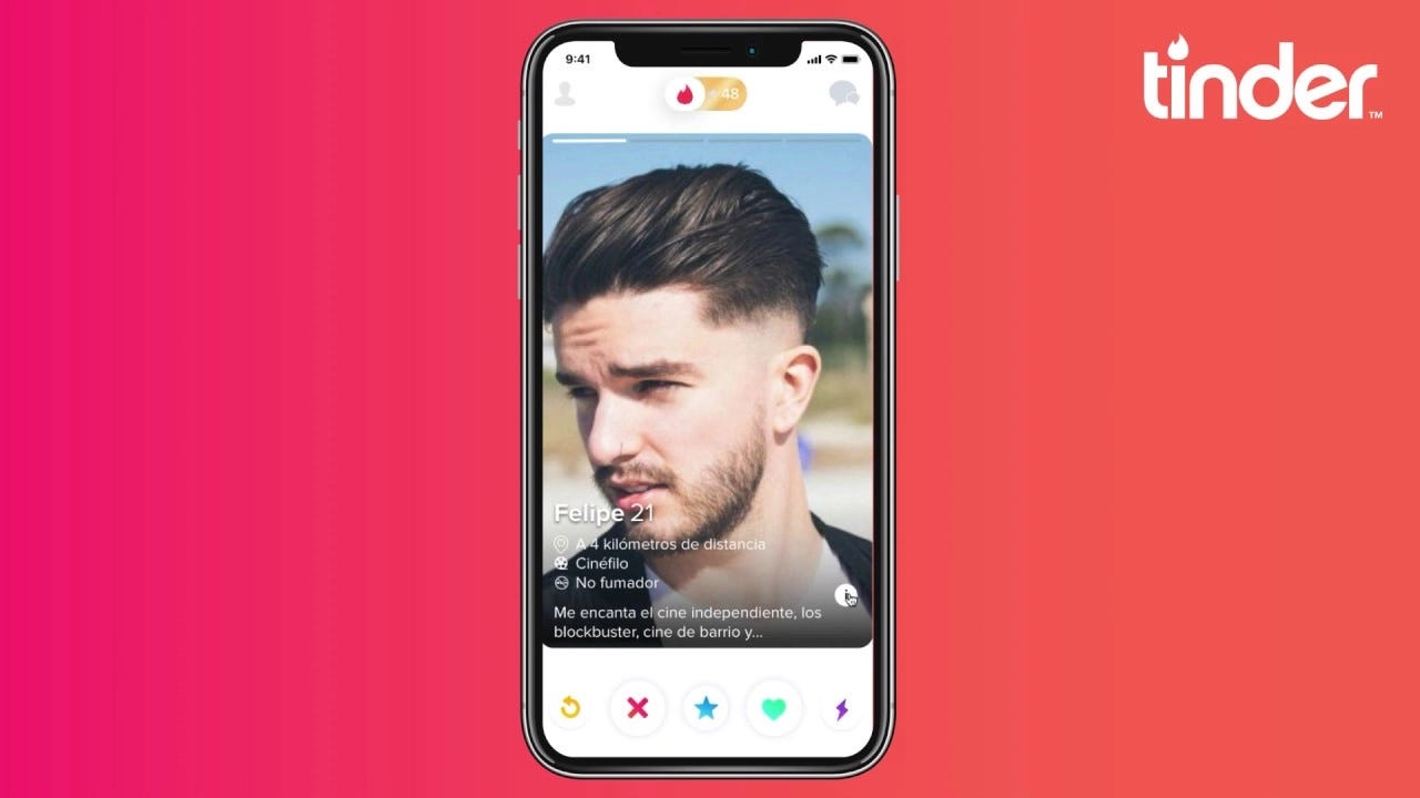
Instead they make swiping and the impression of an endless array of better options attractive features in themselves.
For every swipe, a user feels like they’re making progress. Yet so many complain about feeling burnt out by the process.
Honest and ethical progressive disclosure promises a transformation and ensures that each step of the way makes a meaningful impact.
9. Animate your words
Guiding users through an interface does not always have to be so wordy. Sometimes the best guidance can be done using subtle visuals:
Using the primary colour of an app to signify the most critical step on a page
An animation when you click Buy that draws a user’s eye up to the shopping cart icon
A pulsing button to indicate where a user should click next
Visual communication almost always trumps written communication.
10. Let them explore
This one is a bit controversial… and potentially reckless. But seems like so much fun to me!
So use this at your own risk 😜
I believe that users have become a bit too complacent with easy apps.
Of course I believe that every app should be usable and easy to understand, especially when it comes to the primary promise.
But there’s a huge part of me that’s also in love with the idea of houses with secret passageways, and treasure hunts, and Easter eggs.

When we know that an environment has those kinds of elements, I think we tend to pay more attention. We tend to look around more deeply and with more intention.
And I wonder what it would look like if we incorporated that spirit more into our apps. If we let our users know that our app is a bit playful and if we tell them that there are some secrets hidden around the interface, then maybe they’d discover our advanced features on their own.
Since I’m posting this on Substack, I’ll use it as an example.
Imagine if you ran a Substack and you charged for your premium content. But you told all of your users that within one of your old posts you’ve hidden a puzzle that unlocks a free subscription for the first 10 people who find it.
How many of your readers do you think would start deep-diving into your archive and increasing their engagement?
Perhaps an unexplored key to progressive disclosure is creating an environment worth exploring.
Now that you have some ideas on how to use progressive disclosure, I want to just summarise with some general guidelines.
DOs and DON’Ts
DON’T use progressive disclosure…
to delay the fulfilment of your transformation promise. Progressive disclosure is all about giving users what they need.
purely for aesthetics. Simplifying your UI could risk giving your users more work by making them search and click for details. Information generally benefits from being both simple and accessible.
DO use progressive disclosure…
visually. They say that 55% of communication comes from body language. And in our apps animation isn’t just a tool for bringing an app to life, it’s also a great strategy for communicating more efficiently.
to spark curiosity. We shouldn’t just hide advanced features to protect users from overwhelm. We should design in curiosity to keep them interested long enough to uncover those features.
If you’d like even more tips about using progressive disclosure to prevent your users from feeling overwhelmed, then free to check out this video I made all about that 👇
Hello again, I just want to thank you for reading! I’ve been having a lot of fun diving deeper into some product design and user psychology in these posts. I’m going to be travelling through Japan these next couple of weeks, so I’m eager return home with a hyper-invigorated sense of design inspiration!
Really hope you’re doing great too and will talk to you soon.
Lamar