

Notion starter kit: Make it easy to read
The more deliberately we structure our pages, the less effort it takes to read them.

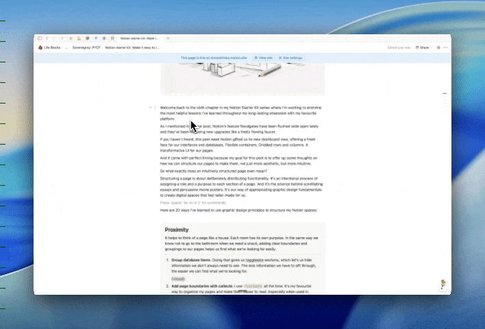
Welcome back to the sixth chapter in my Notion Starter Kit series where I’m working to enshrine the most helpful lessons I’ve learned throughout my long-lasting obsession with my favourite platform.
As I mentioned in my last post, Notion’s feature floodgates have been flushed wide open lately and they’ve been releasing new upgrades like a freely flowing faucet.
If you haven’t heard, this past week Notion gifted us its new dashboard view, offering a fresh face for our interfaces and databases. Flexible containers. Gridded rows and columns. A transformative UI for our pages.
And it came with perfect timing. Because my goal for this post is to offer up some thoughts on how we can structure our pages to make them, not just more aesthetic, but more intuitive.
So what exactly does an intuitively structured page even mean?
Structuring a page is about deliberately distributing functionality. It’s the process of assigning a role and a purpose to each section of a page. And it’s the science behind scintillating essays and persuasive movie posters. It’s our way of appropriating graphic design fundamentals to create digital spaces that feel tailor-made for us.
Here are 20 ways I’ve learned to use graphic design principles to structure my Notion spaces.
Proximity
It helps to think of a page like a house. Each room has its own purpose. In the same way we don’t head for the bathroom when we need a snack, adding clear boundaries and groupings to our pages helps us know where to find what we’re looking for.
Group database items: Doing that gives us toggleable sections, which let’s us hide information we don’t always need to see. The less information we have to sift through, the easier we can find what we’re looking for.
Add page boundaries with callouts: I use /callouts all the time. It’s my favourite way to organize pages and make them easier to read. Especially when combined with toggles and headings, they make for much cleaner looking pages. I’m linking my library of callout designs, so feel free to grab some for yourself: Design system: Callouts
Negative space: Contrary to what I said in my post about the benefits of reducing the number of touchpoints it takes for us to get what we want, I like to give my pages breathing room. Adding more white space might force us to scroll a little more, but quiet areas also help to prevent information overload.
Click enter on your keyboard a few more times between sections.
Avoid full width pages.

And embrace breathable headers.


Contrast and consistency
I’ve always been a fan of a good word search. Hunting down specific sequences in a sea of letters feels like a worthwhile mental workout. But as much as I enjoy them, I don’t want the experience of reading through my everyday workspaces to feel the same way.
And that’s where balancing contrast and consistency comes in handy. When we’re consistent in our design, contrast becomes more noticeable and we can use that to our advantage to make information stand out.
Styling text: Bolding, italicizing, underlining, quote blocks, code blocks, etc. When it comes to using text decoration to spotlight information on a page, I’m personally a fan of a heavy hued highlight. I like to use a triple combo of bolding, highlighting, and colouring a piece of text, all at once.

Design system: Creating a design system that’s consistent throughout a workspace makes it feel like ours. Personalized. Intentional. And cohesive. Being consistent makes creation faster. Deciding ahead of time how we want to apply meaning to colour, what typography we want to use, and how we like to label things, etc., it’s all a strategy for preventing decision fatigue and allowing us to focus on content as opposed to tumbling down redesign rabbit holes. For example,
When it comes to titles I know that I prefer only capitalizing the first word. And when I use inline titles, I like to bold the text before the colon and capitalize the first word after it.
This is how I title things
Inline titles: That is how I title things inline
When I use colours to rate things, I know that blue means I love something, green means I think something is excellent, yellow means I think something is not bad, pink means that something is not for me. And I try to avoid using those colours for anything other than those purposes.

Grid systems
When trying to figure out how we want to organize the layout for our Notion pages, it helps to think of them as colouring books, as opposed to sketchbooks. Drawing inside of lines that were already decided upon makes life a lot more easy than confronting a blank page and deciding everything from scratch.
Master 1D before 2D: Whenever I’m working on a page whose layout I’m not happy with, I’ve found it helpful to strip it down to one dimension before attempting it in two dimensions again. Shrinking the width of a page and removing any embedded columns to make things linear helps to uncover inconsistencies in styling and to reorganize and group information hierarchy in a way that makes sense.
Find your favourite layouts: When I first learned that we can create columns and get creative with the layouts of our pages, I treated every new page as its own unique environment. For each one, I’d experiment with different layouts on the spot, moving things around until the pieces of the puzzle fit together nicely. Overtime, I discovered which layouts I liked the most and started using those by default. Today, that saves me a ton of time.
The faster we can figure out which layouts we like the most, the less time we spend iterating. Here is a library of some of my favourite layouts, feel free to copy them into your own workspace. Design system: Layouts
Database dashboards: Now that Notion has released its new database dashboard feature, we’ve got a responsive grid builder that makes creating layouts even easier.
Focal point
Surfacing the most important information on a page is one of the most impactful and time-saving layout decisions we can make.
Reduce time to impact: In my post about how to make it easy to find information, I mentioned the product principle of “reducing time to impact”. It proposes that we surface the sections we’ll interact with the most to the top of our pages. To put that in practice here are some things we might consider putting above the fold (the area that exists on a screen before scrolling):
Graphs or numbers in a dashboard view to summarize key data in a database we frequently interact with on that page.
Custom /buttons for our main actions on that page.
Hyperlinks to key sections of our page that we want to be able to easily jump to.
Desktop vs mobile: Since there is a lot less information that can be shown above the fold on a phone, it helps to be even more intentional about where we display information on a page. When I know I’m going to be looking at a page on my phone, here are some layout strategies I like to use:
Tables of contents: Add a /table of contents to the top of long pages to avoid having to scroll to find what you’re looking for.
Toggles: Use /toggles to contain and hide page sections.
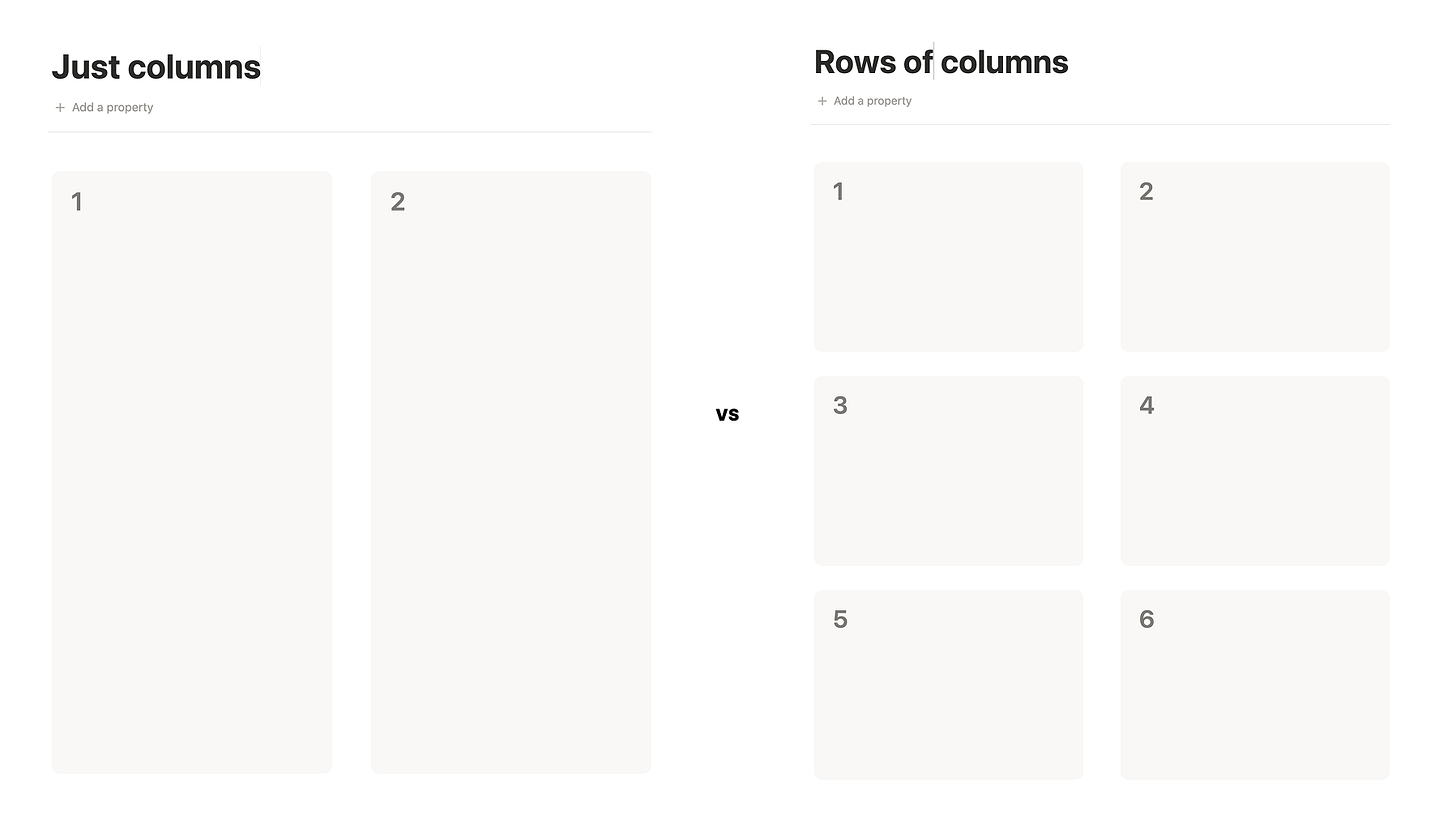
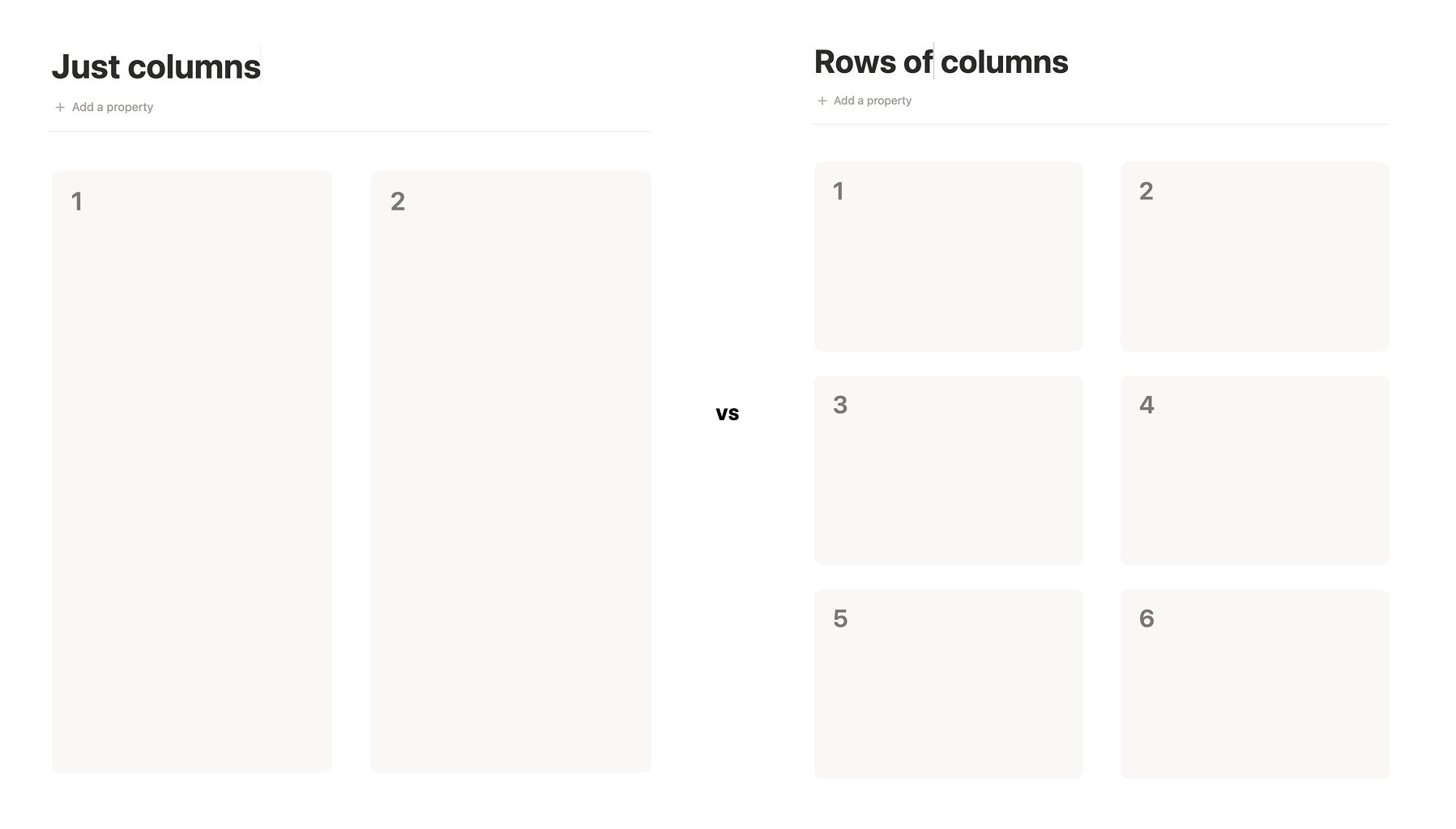
Columns: It’s worth remembering that /columns tend to wrap mobile. Information in column 2 will be pushed below information in column 1. So it can be helpful to use multiple rows of columns instead of just columns.
Hierarchy
Good hierarchy transforms reading a page into reading a map. It provides landmarks that let us navigate with ease.
Our natural navigation styles: There are many means of achieving hierarchy on a page: headings, indentations, embedded callouts, font weight and styling, etc. Personally, headings tend to look similar to me when I don’t see them in the same view (a level 1 heading might look similar to a level 2 heading when they are far apart). So experimenting with different options can help us understand which strategies fit with our natural navigating styles. For me, that tends to be a combination of embedded callouts and headings.
Sequencing section: It might feel a little fluffy to think about storytelling when fixing together a finance dashboard. But pages that tell a story, are pages we can picture putting into practice. For example, a personal finance dashboard with a storyline is structured in a way that:
Keeps us in mind as the protagonist. It doesn’t just follow templates that already exist. It surfaces our objectives to the top of the page. It’s built around our goal of reducing spending on groceries and investing in our eclectic collection of trading cards.
Has chapters. It groups our information in a way that makes sense to us. There are meaningful titles that don’t use accounting jargon we’re not accustomed to.
Has a plot. It helps us fantasize about futures we want to aim for.
When we design spaces that tell a story, we switch from designing for what feels like the right thing to do, to what feels like the right thing to do for us.
Databases
Finally, let’s finish off with a rapid round of readability tactics I like to apply to my databases.
Group subpages together: If a page has embedded subpages, surface them to the top and then link them again below, so that they’re all grouped together and easy to access when needed.
Labelling views: Don’t just leave view labels to their default “Table”, “Gallery”, “List”, etc. Title them with something meaningful. If it’s difficult to come up with a title for a view, then it could be a sign that that view is not serving a useful function.
Minify dates: Dates properties can take up a lot of space, especially when we want to add them to our list views. Changing their formatting to “Short date” is a nice little hack for reducing visual noise.
Formulas for painted properties: Take advantage of formula properties. They can add styles and helpful context to our properties. For example, we can use them to add helpful text to numerical properties or add colour to highlight data.
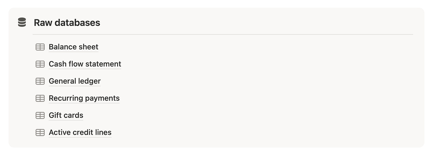
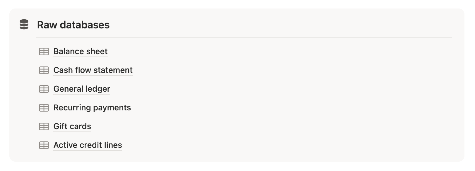
Group database sources together: One feature I always have a hard time with in Notion is understanding whether I’m looking at an original database or a view I’ve created. I’ve found it extremely helpful to place original databases in a section of my page with a “Raw databases” title. That way if I ever want to delete a view, I don’t have to worry that I’m inadvertently deleting the entire database.
Compacting properties: Being selective about which properties to display in a view is already a huge win. But deciding which properties you want to have grouped together in a view can be a nice way to add some layout polish.
Calendar layouts: When working with calendars, I like to:
Wrap page titles for more context
Embed Notion calendar where I want to see multiple calendars integrated into the same view.
Hide database toolbars: It’s a small update, but I like to collapse the toolbars on my databases when I’m not using them in order to reduce the visual clutter on my pages.
That’s it for this one! I hope I was able to offer something useful for your use case. And if so, then stay tuned for my next chapter where I plan on prattling on about how to make Notion easy to maintain.
See you then 👋😁