

Notion starter kit: Make it pretty


Creating an aesthetic Notion isn’t just for vanity. It serves an important psychological function as well.
The more a space feels like ours, the more we’ll want to return to it.
Unfortunately, designing a space can be time-consuming. We end up tinkering between colours and layouts and eating up more time than we expected. And even worse, we end up repeating that same process for multiple different pages, asking the same questions and working through the same decision processes we’ve made before.
In product design, the solution for this is developing a design system, essentially a set of rules and preferences that you’ve decided on once and can reuse anytime you need to.
In today’s post, I’m going to share some of the elements of my personal Notion design system along with some quick design hacks I’ve learned along the way.
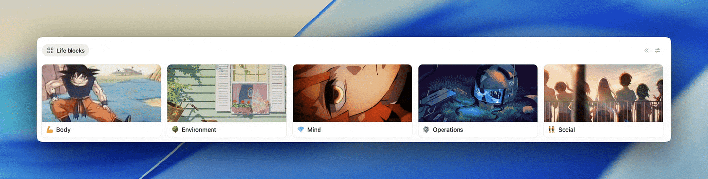
Databases
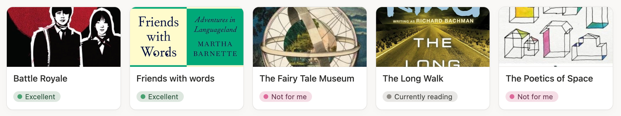
Hide page icons for a more minimalist look.
By default, whenever we create a page in a database, a file icon is placed before its title. When the page has no content, the icon has no lines and looks empty. When there is content, there are lines in the file icon making it look full. So it can be useful for seeing at a glance whether a page is worth clicking on. However, when we don’t care to know whether or not there’s page content, it can be unnecessarily repetitive to see that icon on every page. In those instances, I like to go into the settings and toggle off “Show page icon” for a cleaner look.
Hide database titles when your view title is enough.
In situations where the database is obvious, I like to minimize visual noise by going into the layout settings and toggling off “Show data source title”.
Hide the database tools when you’re not using them.
Just like how we close our toolbox once we’ve finished using our tools, when I’m finished using the tools in a database, I’ll hide the toolbar to reduce the visual clutter.
Use conditional colouring for functional aesthetics.
There’s a great feature called “Conditional colouring” that allows us to change the colour of the items in our databases based on properties. For example, if you track your finances in Notion, you might use conditional colouring to automatically have assets highlighted in green and liabilities in red.
Use formulas to style your properties.
The formula property can be a great way to add styling to database. For example, you can use it to add colour to properties using the style() function. It can be particularly useful when you want to apply conditional styling to properties as opposed to entire pages.
Design once, then use templates.
Creating templates in our databases can save a lot of time. Instead of repeatedly fussing with page layouts and styling pages one-by-one, it’s much more efficient to create a template, define your styling once, and reuse it across every page in your database.
Use the new dashboard view for cleaner overviews.
Notion recently released its new dashboard database view, which makes it easier to see multiple views in a more organized way. I’ve been using it when I want a snapshot of several views at once.
Tables
Erase table lines for cleaner look.
We can reduce the visual noise of our table views by toggling off the view vertical lines option in the view properties.
Galleries
Add gifs as gallery page thumbnails.
In order to make my gallery pages more lively, I use Pinterest to look for anime gifs I can upload to Notion to make my gallery cards more fun.
Use a thumbnail property for galleries when you don’t want to use page content or covers.
When I have an image that I want to display as a gallery cover, but I don’t want it to show in my page content, I’ll save my image in a file property titled “Thumbnail” that I can then access from the gallery view settings.
Videos as gallery covers.
Notion offers the ability to use videos as gallery covers. We can even play a video straight from the page cover without having to go inside.
Pay attention to landscape versus portrait images.
Landscape images look much more immersive in galleries because they stretch more easily to the edges of the card without losing context. So when I’m looking for images in Google, I often specify landscape mode in my search.
Portrait images fit to cover
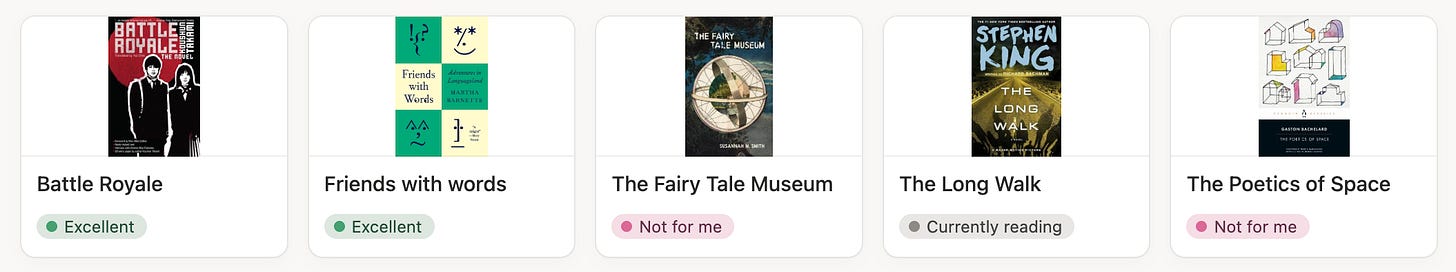
Portrait images stretched to cover
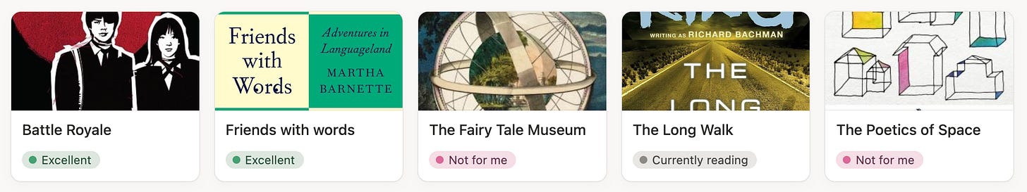
Landscape images stretched to cover
Compact properties for cleaner looking boards.
By default, properties stack on top of one another, but in the database layout settings we can also bring them in line so they read one after another.


Page consistency
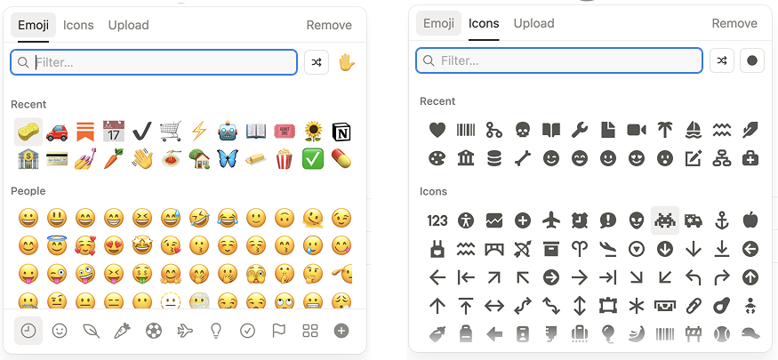
Decide on a system for using icons versus emojis.
Personally, I like to use emojis on pages and icons on databases, views, and sections. I find that emojis can be a bit visually distracting, especially when used in a page. Icons offer a nice alternative for non-intrusive visual elements.
Be consistent with styling.
Consistency of components is the key to a clean workspace. When you create a callout, what does the content inside look like? How do you organize the hierarchy? How do you use underlines, bolds, and italics in your workspace? Having a consistent design system for patterns like these reduces random variation and makes everything feel much more intentional.
Curate page layouts.
I find it helpful to have a few go-to page layouts in my back pocket. Pretty much all of my pages are some variation of the few page layouts that I like the most. That way I don’t have to spend time considering the layout for any new page.

Blocks
Align images to your liking.
Instead of defaulting to the left-aligned images, we have the ability to play around and also move images to centre or right alignment.
Use /callouts to section pages off and organize content.
Callouts are my go-to way of sectioning off pages and organizing things, making every page look neat and easy to read.
Switch things up with /tabs instead of /toggles.
Notion recently released their new tabs feature. Similar to a database with multiple views, we can now create a block with tabs and organize content inside.

Visual semantics
Grayscale your select and multiselect properties.
Colours benefit us most when we use them intentionally and consistently throughout our workspace. When we create multi-select or select properties where colour doesn’t serve a purpose, such as when there are so many options that colours repeat, I find it best to simplify them and use a simple default or grey option instead.
Create custom emojis.
Notion allows us to upload images in order to create custom emojis and icons. I’ve found it to be a nice way to add a little more personal context. For example, I’ve uploaded the icons for all of the main platforms that I use, like Substack.
Combine text colour and background colour when highlighting text.
When it comes to using text decoration to spotlight information on a page, I find that a triple combination of bold, text colour, and background colour applied to a piece of text is a bright solution for highlighting information.
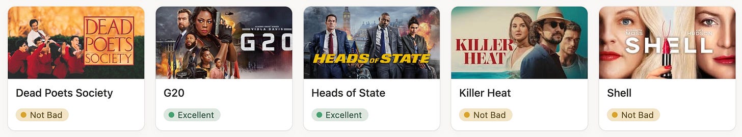
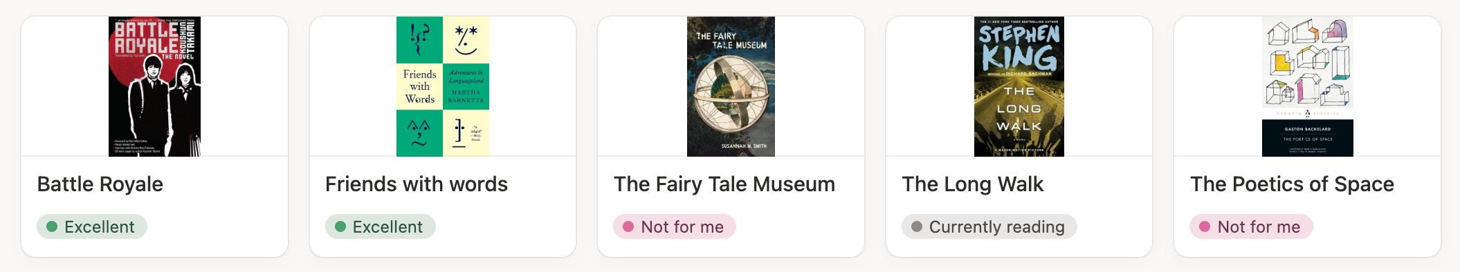
Add meaning to colour and be consistent.
I find it helpful to use the same colour in different circumstances to share similar meanings. For example, I reserve blue, green, yellow, and red for the following grading and status meanings:
💙 Love it / Done
💚 Excellent / Prepared
💛 Not bad / In progress
❤️ Not for me / To do
Staying consistent with this pattern adds visual language to my space. Colour is used not just for decoration, but to signify meaning.
Thanks for reading!
We dove into a lot of tactical details today. But the underlying goal isn’t just visual. It’s about how it good it finally feels to inhabit a digital environment you designed yourself. Once we move beyond defaults, we gain a sense of ownership of space that actually radiates into the quality of the work we do inside of it.
See you next time for the final chapter in my Notion Starter Kit series. It’ll be about the lessons I’ve learned about how to best take advantage of Notion AI.
See you there 👋😁